DESIGN PRINCIPLES: PROJECT 3 - Visual Analysis
WEEK 10 - WEEK 14Hussain Waheedh
Bachelor of Design (Hons) in Creative Media
0344802
Design
Principles GCD60804AC182
Dr. Charles Group - Section 1

INDEX: LECTURE
PROJECT 3
VISUAL ANALYSIS
MY DESIGN
FINAL SUBMISSION
RATIONALE
WEEK 11 - LECTURE 8: VISUAL ANALYSIS
Visual analysis is a method of understanding design that focuses on the elements and principles of design. It is a description and explanation of visual structure. The purpose of visual analysis can also recognise the choices that a designer made in creating the design as well as better understand how the formal properties of a design communicates ideas, content or meaning. Visual analysis is a critical part of visual literacy. It helps sharpen critical judgement skills and helps people seek out answers.
3 phases of Visual analysis:
-
Observation: look closely, identify visual elements,
describe everything in your own words. Looking, thinking and finding
good language to communicate what you see
- Analysis: Think about your observation, try to make statements about the design based on observations. Think about specific elements you identified combine together to create whole, and the effect of it.
-
Interpretation: Using observation and analysis are fused
with facts about design (sometimes from designer), trustworthy
historical content. Understand what is the meaning of the design,
and the purpose it was created for.


PROJECT 3: VISUAL ANALYSIS
For this project, I did lots of online research on many kinds of art and headed in directions that I liked. I came across lots of detailed victorian era paintings that I liked very much but then I saw some modernised versions of those victorian style art. Some of them had used different elements of the victorian era art mixed up to create very cool looking artworks that are highly detailed using pens or digital art.

Figure 1.0.0 Victorian era inspired typography artworks on Instagram - 25th June 2021

Figure 1.0.1 Victorian era inspired artworks by Tony Midi - 25th June 2021
I was very impressed by these elements of the Victorian era inspired artworks but the artist I liked the most is Phillip Harris, an artist from UK who combines all these elements to create his artworks. The detailed drawings with different elements in different sides all composed within symmetric and stylised frames with typography included in lots of his art.

Figure 1.0.2 Illustrations by Phillip Harris - 25th June 2021
After observing his work I decided to go with the following artwork "Bewilding" by Phillip Harris

OBSERVATION:
By looking at this artwork, the first thing I noticed was how detailed the whole piece of art is. Every little element is given a good amount of attention to detail. The whole drawing shows a forrest and many elements of a forrest individually and collectively. The main forrest-image is in the centre of the frame framed with a circular border in green outlined by stylised ribbon-looking frame decorated with leaves, flowers and fruits of different sorts that can be found in a forrest. The main forrest and the animals are drawn in black along with four different landscapes of a forrest drawn in the four corners of the artwork also in black. A reindeer, leopard, an antelope and a wolf looks to the viewer while coming out of the forest into the green border of the frame while an eagle spreads it's wings on the top-centre of the frame and a brown bear sitting in the centred bottom of the artwork. This artwork describes the might of the forests and animal kingdom and the beauty of nature as a whole. It speaks in volumes of the richness of nature with the highly detailed drawings.ANALYSIS:
The image is symmetric in all four sides. The symmetry is created using the lines in green colour that composites the whole artwork and gives it a balanced workspace with a good sense of unity for the main elements. The border consists of a centred main circle that is the main emphasis of the artwork along with four circular blank spaces in four corners of the frame that gives space for the secondary elements that are emphasised. The green frame has repetition used to create similar elements of flowery plants and fruits that are balanced across the artboard. On top of the green border, the main elements are centred and drawn in thick and thin black line art. All the animals on four sides of the artwork are looking directly at the viewer, which also creates imaginary lines that helps the focus to go to the centre of the artboard. The varying sizes used in the drawing from the main forrest to the animals, then to the landscape drawings and finally to the green border creates a neat hierarchy and flow in the artwork and preserves the unity of elements.INTERPRETATION:
This artwork named "Re-wilding" was made for an editorial for ARTE-Magazin that discusses re-wilding projects happening across Europe. This artwork such as many of the other artworks by Phillip is inspired by Victorian era paintings that has these unique detailed line-art styled paintings. The main medium used in this particular artwork is pens and digital colouring. The heavy use of pen strokes that creates the realistic details is achieved by a lot of time spent and he did that very effectively on this piece. The choices of individual elements used to represent the forest feel in a very pleasing aesthetic way is very clever. Also the decorative style of using elements of the main idea for the frame-composition is very well displayed in this artwork. The modernised re-make of victorian era artworks gives me the excitement of the idea of the unlimited ways of creating art and that there is so many unexplored areas and ideas waiting to be found by artists and designers.
The reason I chose this design by Phillip Harris is partly because
complex line art is something new that I have been wanting to learn
for a while and I found a good opportunity to give it a try. By
looking at the artwork, I noticed that he did his homework on the
references for the individual elements used to portray the forest from
animals to little plant leaves. Every little object in their own way
gives way for the whole design. Which is exactly what I wanted to do
for my design.
I've heard so many stories in my childhood of sea
monsters attacking sailers and fishermen in the open sea in the past.
I have been fascinated by these old Maldivian tales that tell the
scary stories, made-up or otherwise, but they also tells about how our
people used to travel in Sailboats called "dhoni" from one island to
another and fish in the open sea. These sailboats were very uniquely
crafted and built for the tough seas. I wanted to recreate one of such
stories. The idea was to show a kraken destroying a sailboat and
dragging it into the waves.
IDEA EXPLORATION: To create this artwork, I checked the
selected artwork along with many other artworks by Phillip Harris to
grab an idea of his style of work. And then I searched online for
photos of a Dhoni. Here are some photos I came across:


The second part is the Kraken. I searched for old drawings of Krakens and got loads of line-art drawings from long ago that fits perfectly with the style. I even found some similar drawings from Philip himself.

Figure 1.0.5 Sea monster reference from Phillip Harris - 25th June 2021

Figure 1.0.6 Sea monster reference from internet - 25th June 2021
Lastly, I wanted a frame for the artwork. Since the idea for the artwork resembles these deadly accidents of old times, I thought of looking for something that would go with that meaning. I found some photos of old Maldivian tombstones. These tombstones were made from coral stones and they have very beautiful designs hand-carved on them. I figured since it was death on the seas, it will fit very well with the idea. Here are some images I found online of these tombstones and the designs on them:

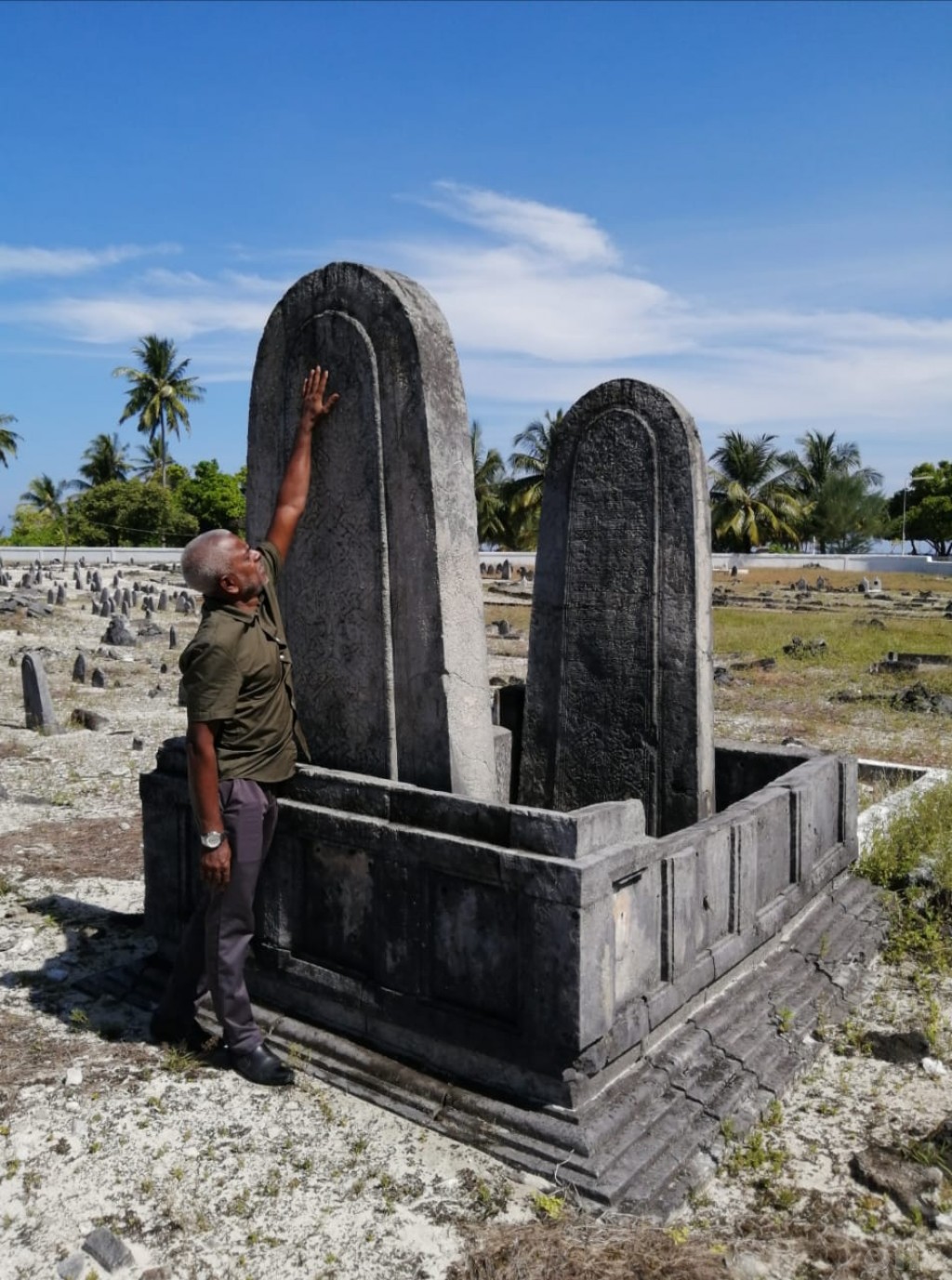
Figure 1.0.7 Hand-carved Maldivian tombstone designs - 25th June 2021
DRAWING PROCESS:
After I got the references for my design, I started sketching the idea. I did some pencil sketches. on the paper and started drawing using a Uni-pin 0.05pt pen. I made guidelines using a pencil of the main design. The design by Phillip Harris had very linear shapes and circles used as main guidelines so I used a centred main circle and an outside square to draw the frame on.
Figure 1.1.0 Initial sketch - 25th June 2021

Figure 1.1.1 Line drawing process - 25th June 2021
I kept testing the pen strokes on a different piece of paper before drawing on the actual sheet. Different parts require different kinds of strokes and stipplings so It will be a mess if it goes wrong. For the pitch-black areas, I used a 0.8pt Uni pin pen.

Figure 1.1.2 Detailing line drawing - 25th June 2021

Figure 1.1.3 Detailing line drawing - 25th June 2021

Figure 1.1.4 Drawing the frame - 25th June 2021
On a separate page, I sketched the patterns on the tombstone and tried different styles to see how it would be best drawn as a line art. These patterns were hand-carved on huge chunks of coral and had unique designs for different people at that time.

Figure 1.1.4 Detailing frame - 25th June 2021

Figure 1.1.5 Post editing on Photoshop - 25th June 2021
The final design turned out pretty good and better than I expected but something was missing. I saw that Phillip harris used blended colours on his work so I tried to put in some colours to see if it was working.
Some of the colours worked and some didn't so after a while everything
started feeling too saturated and off-point. So I went back to the
original and tried to look for what I wanted to emphasise on it. I noticed
the centre piece lacks attention because of the frame. So I used a blue
shade for the frame to dim it a little and things started looking much
better. I tried different shades of blue and other colours and finally
decided on what I wanted to go with. I also did some minor corrections on
the line-art work and then finalised my design.

Figure 1.2.1 Final Design.pdf - 25th June 2021
This drawing is inspired by the artwork "Bewilding" by Phillip Harris. The original artwork was a victorian-era styled line art drawing that was later digitally coloured. His style, similar to some victorian paintings, uses highly detailed line art to draw sceneries and artworks with a high emphasis in the smaller details and forms of the elements in the composition as well as the stylised frames and structures. I wanted to use that style to show one of my earliest memories of sea-monster tales I used to hear when I was a kid.
It is a realistic drawing that shows a sea-monster, a Kraken, attacking a
sailboat and destroying it and dragging it into the waves. The important
thing about Phillip Harris' style is, as I mentioned before, in the
details. So the process is mostly researching the setting of your
drawing and finding references of what that scene would actually look like
by looking for the elements and materials that would be in that particular
setting.
In my case, I had to look for the complex and unique designs of Maldivian
sailboats or as they are called, "Dhoni", as well as sea monsters and old
Maldivian hand-carved tombstones to create a frame that would give the
meaning of how these tales are often connected with death.
I used a 0.05pt pen to draw the whole drawing and had to spend hours to
perfect each detail of every different parts of the Dhoni and the sea
monster and I also had to create a line-drawing of the designs found in
old Maldivian tombstones that were hand-carved on huge chunks of coral.
REFLECTION:
I love line-art drawings and I've been following Phillip Harris' works for a while and I've wanted to try doing such drawings myself. I really enjoyed this project as I got to really get deep into line art and getting references of small details required to make a good line-art drawing. I had a good time going through old photos and re-creating childhood stories and memories the way I imagined them to be.
FEEDBACK:
Comments
Post a Comment